
- Apr 13
- 4 min read
Today we are joined by Britton Stipetic from Rogue Studio, do discuss the process and design behind the portfolio website of Radical Face they were tasked with creating:
Please introduce yourself
Howdy, I am Britton, the founder and creative director of Rogue Studio, a worldwide branding and digital design studio from Cape Cod → Tokyo. Partnering with companies that need to transform their image and radically stand out. We’re a nimble team of designers and creative developers, focused on creating uniquely human, culturally informed, and aesthetically relevant brands and experiences.

Tell us a bit about yourself, your role, and how you found your way to a creative career.
I fell in love with the possibilities of the early internet — the ability to weave design, motion, sound, and animation all into one experience blew my mind. It was everything I loved, sandwiched into one career. Sign me up. After design school, I started freelancing with a variety of agencies, which was great, but I wanted to build something. I come from a family of entrepreneurs and felt the pull to start my own thing. So in 2019, Rogue was born — and we're still here.
How did you come about this project? When did you work on it; did you work on any other assets for this creative, or was it just the website.
We've been working with Radical Face since 2022, starting with an interactive experience we built for his EP A Light in the Woods. From there, he made the bold decision to move off social media entirely and consolidate his whole digital presence to just his website. We started dreaming up what that could look like in 2024, and launched the final version in 2025 — to great applause.
Was there a main inspiration - visual or thematic - that guided you in the process of this portfolio design?
The client came to us with one core idea: the site should feel timeless, and flexible enough to house his multiple art forms — music, visual art, and writing. That brief led us straight to magazine design. Magazines have mastered the art of presenting varied content under a cohesive visual system, and that felt like exactly the right reference. It gave us a framework that's both timeless and adaptable. The client loved the idea. From there, our lead designer, Calvin, began experimenting, and the rest is history.

Share a few words about how you approached the idea of personal branding when creating this portfolio
Radical Face is a remarkably trusting client — and that trust is everything. He gave us some direction, but largely handed us the keys. As long as the site looked great and hit that mark of timelessness, we had full permission to run with it. That kind of creative freedom is rare, and we didn't take it lightly.In terms of process, we always develop several concepts tied to the emotional state we're trying to capture for the audience. Once one is selected, we move fast — building things out quickly, then layering in animation to boost the energy and bring the whole thing to life.
Share any tech details, special tools or web-design features you included, or any behind-the-scenes information
One of our favorite hidden touches — the audio section on the homepage plays a custom loop that Radical Face created himself. As you scroll, it sounds like you're tuning an old radio. That kind of detail sets the tone for the whole site. From the radio tuning, to the distinct personality of each section, to the animations, to the handwritten signature that draws in at the bottom — a lot of love went into the details.
On the technical side, we keep things intentionally simple: vanilla JavaScript and CraftCMS. That's by design. They're light, lean, and fast — and they're built so clients can actually maintain them themselves.


Walk us through the design process of a project page, especially how they differ in each category (audio/text/visual)
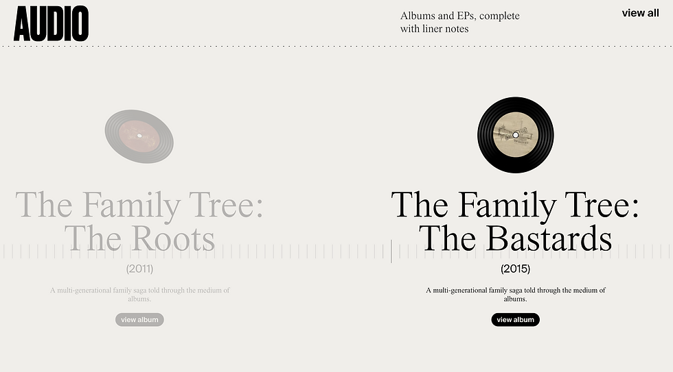
The site is organized around Radical Face's three artistic disciplines — audio, writing, and visual. Each section has its own design language rooted in a real-world analog.
Audio draws from the experience of flipping through a record bin — that tactile, discovery-driven feeling. Open a release and it shifts into a magazine-style layout with columns, dense text, and a sticky visual element always tied to the music.
Writing takes its cues from newspaper and magazine typography — centered, clean, and timeless, with a flexible column structure that accommodates images, pull quotes, and more.
Visual is pure gallery — a clean white canvas where images take center stage. Click in, and you get more context and depth, with series and projects organized for easy exploration.
Each section feels distinct, but they all live under the same cohesive design system.

How did the process of curation take shape when selecting which projects to include in the website.
No curation needed — the whole point of the site was to house everything. This became Radical Face's digital home for all of his work, past and present, across every discipline.
Thank you Britton!


