
- Aug 27, 2025
- 5 min read
Updated: Aug 28, 2025
Website Link
Tell us a bit about yourself, your role, and how you found your way to a creative career
I’m Yifei Luo — or Libby, if that's easier. I’m a multidisciplinary graphic designer and independent creative based in Melbourne/Naarm, originally from Shenzhen, China.
I started with a background in Communication Design, but instead of continuing down the same path for another two years, I decided to try something new — and completed a postgraduate degree in Design and Innovative Technology. That shift opened up more ways for me to think, make, and play. I now work across branding, print, illustration, web, and interaction design — mostly in the in-between spaces where emotion, play, and visuals collide.
Honestly, I think I’ve always been designing without knowing it — making clunky collages, drawing small cute doodles, sketching random ideas in my mind when I was a kid... Then it took me a while to realise that design could be a space to bring all those instincts together. That it didn’t need to be polished — just honest, curious, and maybe a little weird.
When did you work on your online portfolio, how long did it take
My personal website came together gradually over a few months earlier this year.
Most of it was built in between some freelance work and personal projects — late at night, or whenever I felt like tweaking something. I kept revisiting layouts, adjusting interactions, and trying things out — there wasn’t a fixed timeline. I just kept experimenting, breaking it, and putting it back together until it finally felt like “me.”

Was there a main inspiration - visual or thematic - that guided you in the process of your portfolio design? Please elaborate
As I mentioned previously, coming from a multidisciplinary background opened up more ways for me to design and create, and also made me reflect on what kind of designer I want to be. This website isn’t just a portfolio; it also became a journey of self-discovery as a designer.
When I’m designing for clients, I know how to shift styles depending on the brief, and I enjoy that process, but my personal website isn’t about that. If even my own site had to conform to market or viewers' expectations, there’d be nowhere left to fully express myself and that would feel like such a missed opportunity. Therefore, I wanted a space that was just mine — where I could express my design personality freely, and create something a bit messier, weirder, more “me.”
So I approached the website as a kind of personal playground — a soft, experimental space where people could wander, drag things around, and stumble upon little surprises. Visually, I didn’t want a clean grid or sleek minimalism as I’m simply not that kind of person. I was more drawn to layered compositions, drifting layouts, floating elements — something that felt more like a visual sketchbook or diary than a traditional portfolio. Maybe that goes all the way back to childhood — I used to make a mess just to have space to doodle.
The pear 🍐 became a recurring symbol — partly because it sounds like my name in Chinese, and somehow turned into something that represents me. Over time, it also started to feel offbeat, a little odd, and unexpectedly fitting. Just like the site itself.

Share a few words about how you approached the idea of personal branding when creating your portfolio
I didn’t approach personal branding as something that needed a logo, a colour system, or a rigid style guide. That felt too business-like as I didn’t want to sell myself like a product or like a “proper” brand. Instead, I focused on creating something that reflects my personality, my process, and how I want people to experience my work.
For me, personal branding is less about being recognisable at a glance, and more about being memorable over time. That’s why I leaned into mood, interaction, visual rhythm, and small surprises. I wanted the site to feel like me — not just represent me. Ideally, I’d love for people to land on the site and immediately think, “this looks like Yifei/Libby.”
Share any tech details, special tools or web-design features you included, or any behind-the-scenes information
The site was built on Cargo, but I ended up writing a lot of custom code — mostly JavaScript and CSS — because I wanted it to feel more interactive and expressive, like an actual playground. There are lots of little tricks scattered throughout the site for visitors to explore — like draggable notes, floating elements, layered z-index shifts, hover-triggered animations, and a zoomable resume feature that expands on click. Most of the interactions are light and a little playful — not to show off, but to make the experience feel like an open invitation to explore. I wanted everything to feel a bit alive, and slightly unpredictable.
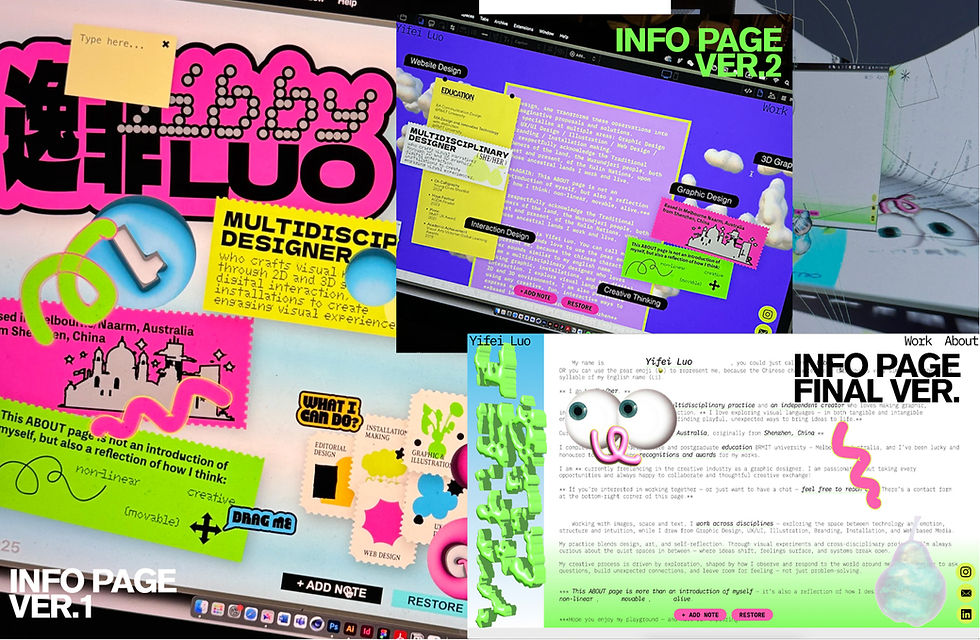
Honestly, I didn’t follow a traditional website-building process or start with a structured plan. I just adjusted as I went, until the page started to feel right. Here’s a behind-the-scenes fact that the very first page I designed wasn’t the homepage or the project section — it was actually the info page, because I felt it was the most personally connected to who I am. There were countless iterations along the way, and no real wireframe to reference. Once that page felt right, I began building the rest based on its tone and rhythm. I was simply trying to create something that looked and felt like “me,” piece by piece, from the inside out.

Walk us through the design process of the project page
I mentioned that I started with the info page and built the rest of the site based on its tone and rhythm — soft, layered, a little fragmented but intentional. So even when it came to the project pages, I tried to stay within that emotional outline. I treated each project page as its own little space — I didn’t want to use a strict template across everything. Instead, I responded to the tone of each project and shaped the layout around how it felt.
Some projects are more narrative, so I gave them more room to unfold; others are quieter, so I kept the rhythm slower and added more breathing space. I played around with spacing, layering, and image flow to create a certain mood, rather than just presenting information. My goal wasn’t to show the work as efficiently as possible — it was to let each project have its own atmosphere, and to invite people into it.
How did you curate the chosen projects for your portfolio
I didn’t choose projects based on scale or polish, I chose the ones that felt closest to how I like to think and make. Some are experimental, some are emotional, some are just quietly weird, but each one holds something I care about.
I wasn’t trying to create a “complete” portfolio that looks 100% perfect, but rather a constellation of work that reflects different sides of me. Some of the projects might feel a little unfinished or rough around the edges, but they represent the parts of design I want to keep exploring.

What web-design project are you working on currently?
I’m currently working on a series of new sites for a client, and since it’s still in early development, I can’t share too much just yet — but it continues my exploration into emotional interaction, spatial storytelling, visual rhythm, and playful interface design. It’s an ongoing experiment with mood-driven interfaces, soft transitions, and alternative ways of navigating digital space. I’m excited about creating something that responds more to feeling than function.
This has been a new kind of challenge that has pushed me to learn, question, and rethink how digital environments can feel. Even though it’s still in progress, the process itself has already opened up a lot for me. I’m excited to see where it leads next.
Thank you Yifei!


